What makes a great movie poster?
An acclaimed poster designer weighs in on artwork for The Flash, Oppenheimer, and more—and reveals his favorite poster of all time (hint: it's from 1968!)
Film Features Films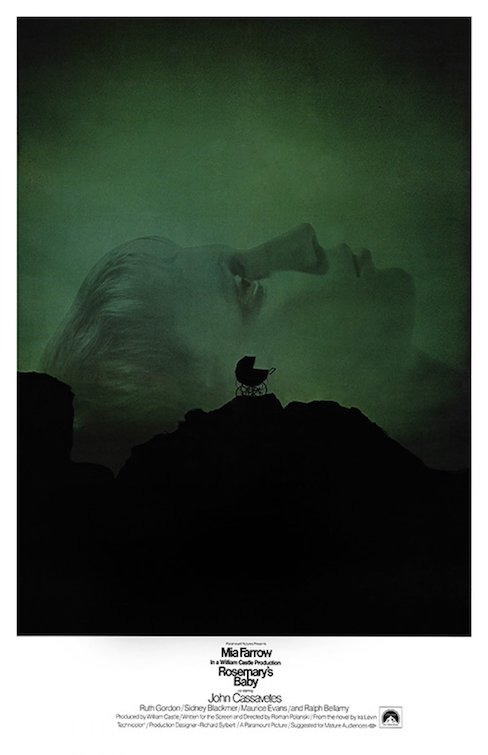
What does it take to make a great summer movie poster? In the age of mega-franchises and endless IP farming, it’s easy to imagine simply yanking a familiar image of a superhero or action star directly from a movie trailer, pasting it on a rectangular background, and slapping it on a wall. But for the people tasked with making movie posters pop at the multiplex or grab your attention on a social media feed, the art of crafting the perfect blockbuster poster means creating something complex, striking, and original in its own right.
No matter what movie you’re helping to launch, though, when it’s blockbuster season it all starts with the same element. “You just want to build excitement, and I think on all blockbuster hits, that’s the common thread,” Kishan Muthucumaru, Executive Creative Director for Print and Digital campaigns at L.A.-based entertainment agency MOCEAN told The A.V. Club. “You’re dropping a little bit of information, these nuggets leading up to the trailers, the payoff, the poster and the launch date. How do you tease it so that people want to see more?”
As obvious as “build excitement” might sound, how poster designers and artists make that happen can vary wildly depending on the film, the stars, the access offered by the studio, and many other factors. In any given summer, audiences will see dozens of posters for the various films vying for our attention, and they’ll range in style from minimalist character spotlights to massive painted ensemble pieces, and everything in between. Each one has its place, and it all starts with trying to capture a particular tone that evokes the film without telling us the whole story.
Hints of horror and sex for X
Take, for example, Muthucumaru and MOCEAN’s work on Ti West’s indie horror hit X, which included a now-iconic teaser poster that captures the essence of the film’s exploitation throwback roots while telling us almost nothing about the story.
“It’s not a big blockbuster hit, but it definitely needed to have a brand, where you look at it and you’re like, ‘Oh yes, that’s it,’” Muthucumaru said. “So you have the nostalgia of those old horror movies. You want to bring the fun factor of a horror movie into it with the color. You want to have it feel conceptual without giving the whole story away, but have something that suggests something sexual in nature as well, but not show it all.”
In two decades of work as a designer and creative director, Muthucumaru has worked on numerous campaigns, designing artwork for films big and small, like Star Wars: The Rise Of Skywalker at Lucasfilm, The Mother at Netflix and Men at A24. It’s given him a wide range of experiences with films at every budgetary and promotional level, and when you talk to him about his far-reaching career in the design world, it’s clear that no two poster design experiences are alike. What’s also clear, though, is that when it comes to major blockbusters, the process can start very early, often so early that there are no visuals to work from.
“When we started on Star Wars, [we] weren’t allowed to see anything,” Muthucumaru said. “We literally sat down with our client who was kind enough to tell us the story of the movie, and we were given no assets because they didn’t have anything to give us. We created everything from scratch using 3D models. A lot of it is … using anything you can get to come up with these dramatic and beautiful visuals. But sometimes you just don’t have very many assets, or you may never see the film depending on what the film is and what studio it is. Everyone’s different.”
Breaking down this summer’s movie posters
Those differences in approach, combined with the different design aesthetics of each designer or design firm, means we get a wide variety of posters every year. So what does Muthucumaru think about this year’s crop of summer movie posters? Let’s start with a non-franchise blockbuster like Christopher Nolan’s Oppenheimer.
“In a design sense, there’s so much negative space,” he said. “Your eye is drawn to the character in the center. It tells a little bit of a story, but not too much. Even if you don’t know who Oppenheimer is and what the story’s about, it intrigues you enough to want to find out more. I think that’s the success of that poster.”
But of course, so much of the summer will be dominated by franchises, including the long-awaited launch of The Flash, a film whose posters play heavily on the revival of Michael Keaton as Batman.
“Fans are going to see this and just fall in love with it,” Muthucumaru said of The Flash teaser poster featuring Barry Allen in the Batcave. “You have this whole Batman kind of vibe to it, you’re bringing these things into the poster. For what this poster is doing, I think it’s really successful. People are going to want to put this poster on a wall. It’s one of those kinds of posters.”
Then there’s Mission: Impossible—Dead Reckoning Part One, a film that uses its poster to play up star Tom Cruise’s endless devotion to insane stunts.
“The Mission: Impossible poster, for me, I would say is extremely successful,” Muthucumaru said. “If I was a Mission: Impossible fan, I would love that poster because it does everything for me, and even if I wasn’t a fan, I kind of like the poster anyway. For a blockbuster, that’s probably one of my favorite posters [this year].”
The all-time favorite movie poster?
It’s gonna be a busy summer movie season packed with intriguing posters and we haven’t even seen all the artwork tied to the blockbusters coming out over the next several months. But what if we stepped back from this summer, all the way through the history of great movie posters, and asked the expert for his favorite poster of all time? Muthucumaru’s choice would be …
Rosemary’s Baby. That would be my absolute favorite iconic poster of all time,” he said. “It’s just beautifully designed. It’s haunting. It drags you in visually. It makes you really look at the poster. The message it conveys is fairly clear. It’s not convoluted by marketing stuff that sometimes we have to do. There was a time I think in the past where it was all about just capturing the film on a poster. And I think that one just did such a beautiful job.”
For more of Muthucumaru’s work, check out MOCEAN’s portfolio of film and TV campaigns.
21 Comments
Best movie poster
“Mandroid” sounds like his own porn name.
oh my god this just triggered some deep childhood memories. I don’t even know if I ever saw this movie and I didn’t even remember the title, but for some reason the Mandroid concept of a half-man / half-tractor cyborg burned itself into my brain. I was fascinated by it.
So I glad I was a child of the 70’s. I’d ride my 10 speed to my local video store where the owner had the store covered in posters. This being one of them was the reason I rented this masterpiece of a film. Not only does the Mandroid attached to a tank, he gets a flying robot pal!
Best movie poster
I’m torn on the Flash one. It’s derivative, but intentionally. I think maybe it’s not clever enough. The one for X is also derivative but the legs making the X is its own thing.Oppenheimer is tough, too. It’s great if you know who he is. Otherwise, it looks like yet another comic adaptation, probably another John Constantine type character.M:I is good. You know what it is, it knows what it is, no need to get into the plot, so here’s a cool shot with a unique layout.
The Flash poster kind of feels like an intentional misdirect to me. Like “hey look at all the Batman we’ve got! You guys like Batman, right? We’ve got Batman! ps: also The Flash.”
When you put it like that, yeah. They want to evoke Batman, but they did it to the point that you forget it’s a Flash movie. It looks like Batman Meets The Flash when it should be the reverse (and even that might be too much, depending on how much Batman there really is). For Batman Forever they had a really nice Batman logo with the Riddler’s question mark wrapped around it. That was nice — it highlighted the villain but kept it about Batman. Similarly, the Dark Knight poster with the Joker’s face painted on a wall with the Batman logo as the lips.
I mean… the Bat symbol literally overshadows the Flash on the poster. It doesn’t even show the title of the film, just the Flash’s symbol. Which, admittedly, anyone who cares about this movie already knows what that is, but I wouldn’t be surprised if an average, non-superhero-movie-interested person would think it’s a Batman movie at first glance.
They almost certainly wouldn’t be useful for promoting the film (and no American studio would approve them), but I adore the Polish tradition of super-arty, weird film posters:https://sabukaru.online/articles/the-insane-history-of-polish-movie-posters
It’s tough to talk posters since I only see them on the web anymore, and you never know if you’re getting original artwork or some Drafthouse-adjacent artist’s take on a film.I am a huge fan of Saul Bass’ work as well as Drew Struzan and the old, early Hollywood-style images. But for modern posters I do tend to like more artful, minimalist approaches rather than blunt, photoshopped stuff.The Flash poster above jumps out at me as incredibly dull, since a third of it is A Large Metal Platform, and in shadow at that. I like the Oppenheimer one, though I wonder if an even more surreal approach would have garnered something eye-catching.
Weird timing with the latest Nerdstalgic video
What happened to movie posters seems to be a similar thing as what happened to animated movies using big name stars to voice the characters..
Even if the movie sucks, at least star power will sell tickets.
Sad but true.
What’s funny is using the Endgame poster as an example of bad doesn’t really make sense because the whole appeal of the Avengers *from day 1* was “HOLY SHIT EVERYBODY’S HERE!”
A painter.
Mexico had some amazing ones, check out this Plan 9:
I’ve always liked The Two Towers poster,
especially when compared to the other version with the floating heads that’s become such a stain on many movie posters.
I like this one. One tower goes one way and the other tower goes the other way.
🙂
It’s remarkable for many reasons, both funny and serious. The way it manages to advertise a movie without using any recognisable actors. The way it basically promotes model making. The way it conveys vast, immeasurable distance between the towers.
For something so geeky it’s just so cool about it.
This might be the best poster ever. Certainly its the biggest gulf between quality of movie and quality of film:
The poster for the tenth Fast & Furious movie is shit.