The jaw-dropping Little Bird takes a surreal approach to a familiar war story
Aux Features big issues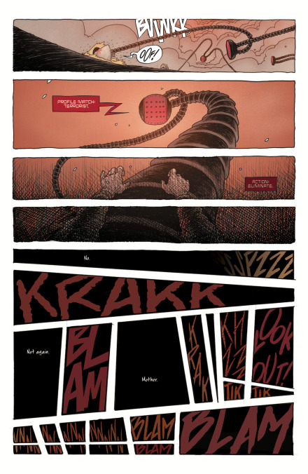
It’s easy to question the intention of filmmakers who make the jump to comics. Are they passionate about the medium, or do they view comics as a way to develop intellectual property that can be adapted for film and television? There’s nothing inherently wrong with the latter, but it can often result in underwhelming titles that don’t take full advantage of comics’ vast creative opportunities. That isn’t the case with Image Comics’ Little Bird, filmmaker Darcy Van Poelgeest’s comic book debut, which follows a group of Canadian rebels fighting to take back their home from the theocratic United Nations of America. Van Poelgeest spent five years collaborating with artist Ian Bertram on this unsettling, exhilarating sci-fi miniseries, taking advantage of Bertram’s ingenuity and understanding of comic book craft to build a narrative that showcases the full range of the artist’s talent.
Bertram’s House Of Penance (2016) with writer Peter J. Tomasi is a paragon of comic book horror, establishing the artist as one of the most exciting visual thinkers in modern comics. His style is instantly recognizable with its flurry of small tic lines, which he adjusts to create different textures and control how the reader’s eye moves across the page and within individual panels. He’s capable of putting pretty much anything on the page. Little Bird demands a lot from him by mixing a sci-fi war story with a young girl’s surreal journey through her inherited trauma. Colorist Matt Hollingsworth, letterer Aditya Bidikar, and designer Ben Didier give the book a cohesive, distinctive visual identity, the strength of this art team elevating the story by bolstering its emotional content.
The premise of Little Bird isn’t too far off from We Stand On Guard, Brian K. Vaughan and Steve Skroce’s 2015 miniseries about the last line of Canadians standing against the United States’ northern expansion. But Little Bird balances the blunt, aggressive force of the military storyline with more introspective and poetic material, giving the book more interesting tonal dynamics that also allow the visual language to shift dramatically. Little Bird #1 takes readers to the Canadian wilderness and the New Vatican as it introduces the main players, but the book enters very different territory when the titular character is shot and killed.
The opening spread of Little Bird #2 is classic Bertram, a hauntingly beautiful image of Little Bird and her mother in the dream space between life and death. Intestine-like tendrils creep up toward the water’s surface and become the roots of a sprawling tree, uniting animal and plant to reinforce the connection between people and the earth. Panels of leaves falling through the air are arranged across the page in descending sequences, forcing the reader to slow down, while they also add a downward motion that accelerates over the course of the scene. The imagery gets even weirder from there, and when the two women leave the tree, they encounter a giant eye that gives Little Bird a look into her mother’s past.
That eye deconstructs as they venture down a Möbius strip path, which floats above the panel border to highlight this dimensional jump. The downward motion that started with the falling leaf continues with the collapsing eye, and inside the pupil emerges an image of a young girl falling, segueing into a flashback that begins with the mother’s teenage body exploding in a bloody mess as it hits the ground. There are a number of cool visual tricks Bertram uses to alter the rhythm of a scene, like changing the distance between and thickness of vertical black lines in the background of a literally ball-busting conversation between the devilish Bishop and one of his subordinates. Or a panel that condenses an international conflict and a personal arc in one fiery, raging shot of a warrior charging through a battlefield.
Starting with the title design, Little Bird uses every aspect of the visuals to inform the story. The title text flows on the page with its thin, curving linework, and the symmetry of Ben Didier’s design visually ties the title to the book’s thematic content. The first and last letters arc up and around to form the dots above the I’s, and their tails swoop under in two identical waves. A third curve loops from the second L through the top of the B, giving the title a silhouette that evokes the hills and rivers of the natural world, which Little Bird feels an acute connection to after her resurrection. Looped lines surround the text on both sides to form a delicate frame, with their rounded M shape creating the impression of two minimalist birds wrapping their wings around the title.
Matt Hollingsworth is an industry veteran with extremely versatile rendering skills and a deep well of knowledge when it comes to using color to take readers on a journey. Hollingsworth also worked on We Stand On Guard, but Steve Skroce’s realistic art style kept him from leaning into the more expressionistic perspective he brings to Little Bird. This is a vibrant book. Hollingsworth uses the full spectrum to make scenes stand out with their own specific dominant colors. The shades are very earthy and natural for scenes focusing on Little Bird and other indigenous tribespeople, while New Vatican scenes are colored with Easter egg pastels, changing the emotional frequency of the traditionally playful, happy hues by connecting them to the church’s vile deeds.
Aditya Bidikar has an excellent newsletter where he breaks down his lettering process, and the Little Bird issue is especially illuminating. He writes about specific choices like having word balloons merge with the panel border to more fully integrate the lettering and the linework, and creating a caption background that resembles the birch bark Little Bird would actually be writing on. Given the specificity that goes into Bidikar’s lettering choices, it would be interesting to learn more about how he approached one of Little Bird #2’s standout moments, a fight scene depicted entirely through sound effects trapped in a web of chaotically aligned black panels.
The page that starts this scene is an exceptional example of this team’s creative rapport, pulling the reader into Little Bird’s head as she’s pinned down by a drone and blacks out. It begins with a full-width rectangular panel of Little Bird getting knocked down, with Bertram pushing against the natural left-to-right reading flow to emphasize the abrupt stop in her momentum. From there, the perspective changes to a first-person view for three panels of the drone scanning its target as Little Bird’s vision fades to black. She can’t see what’s happening, but her body still experiences the chaos of the fight that ensues. Bertram provides the disorienting panel layout while Hollingsworth sets the palette Bidikar uses for his bold sound effects, with everyone’s work feeding into that of their collaborators.
Little Bird pairs creative excellence with consumer value, giving readers nearly twice the amount of content compared to a $3.99 single issue from any of the major publishers. Van Poelgeest mentions at the end of the first issue that they aren’t planning on collecting Little Bird for the foreseeable future, and while he could just be saying that to convince people to keep buying single issues, those who might be inclined to enjoy a story like Little Bird won’t want to wait for the trade paperback. These first two chapters are meaty reads, packed with rich ideas and executed with precision and passion. It’s a comic that could be a cool movie in the future, but it succeeds because the creative team values the things that make comic books a unique form of storytelling.
12 Comments
this looks amazing – lot of people do that moebius style, but this really adds something to it. And thanks for the tip on the letters newsletter, it looks really interesting. Subscribed!
Adds to the style yes. But in no way equal or surpasses the original.
So what you’re saying is, hockey hair will never not be a thing up there?
I really enjoyed house of penance. Especially for the art. I will be picking this up immediately. I hadn’t even heard of it until this article. Thank you. your Big Issues column is one of the best pieces of writing on comics each week.
I mean, they don’t have to collect it if that’s how they feel, but then I won’t read it. Looks good, reminds me a little of one of my favorite books, Prophet.
Looks like a collected version is supposed to drop in October: https://www.amazon.com/Little-Bird-Fight-Elders-Hope/dp/1534313451/ref=sr_1_4?keywords=little+bird&qid=1556510062&s=gateway&sr=8-4
For new and unique titles, buying single-issues is essential to the economic model. Too often, they can get cancelled before the TPB due to low single-issue sales.
Why wouldn’t they release a trade at the end of the arc? This is a very weird comment.
So Gene Simmons got around in Canada too, eh?
Yeah, he pops up to Saskatoon to visit the in-laws now and again.
His wife’s from Newfoundland.
Place called “Dildo”. Really.
I did not know of this comic. Seems like something I should be reading. Recently finished reading the lastest volume of Vei. So Little Bird might be something I like as well.