In case you didn't realize all movie posters look exactly the same, here's more proof
Aux Features Film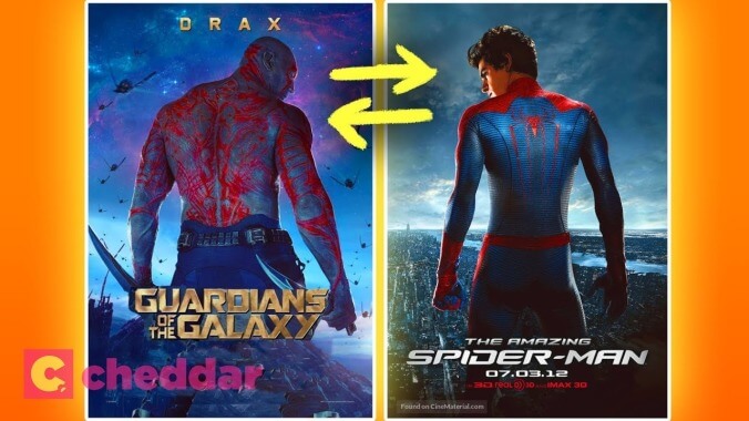
Think of the best movie posters from the past few years. Moonlight’s split image of the three Chirons, Rey’s lightsaber dividing the dark side and the light of Kylo and Luke on the The Last Jedi poster, the ethereal glow of Jeon Jong-seo dancing in Burning, and the deliriously raunchy collage of Emma Stone and Rachel Weisz straddling the Queen’s face in The Favourite poster are some of the most memorable and striking one sheets of late. Apart from being exceptionally creative representations of their respective films, those posters also stand out because they don’t follow the typical movie poster formulas. You know what we’re talking about.
It’s no Olivia-Colman-winning-Best-Actress shocker to learn that the majority of posters look pretty much exactly the same, especially for mainstream releases. The folks at Cheddar have recently discovered this phenomenon and decided to investigate why rom-com leads are always leaning back-to-back on posters, or why there are so many freaky close-ups on eyeballs in genre one sheets.
A new video from the YouTube channel breaks down the movie poster tropes you’ve probably noticed before, but never entirely knew the extent of. From similarly positioned actors to the psychological concepts behind contrasting color schemes, it’s all, of course, about tricking you into buying movie tickets. But most importantly, these poster tropes serve one very significant purpose: helping us distinguish the different eras of Matthew McConaughey’s career. There’s pre-McConaughey Poster Lean, and post-McConaughey Poster Lean.
19 Comments
Similarly, did anyone notice that all articles about how movie posters are all the same are all the same?
Don’t complain; this was still better than any Hugh/Barsanti bitchfest.It’s bad, don’t get me wrong, but still…
In comparison, I have compared comparable articles and I have come to a congruent conclusion that all articles about how all movie posters are all the same are all the same.
All Chancellor Puddinghead comments are the same.
All of my comments are the same.
Followed by the same gif response and cute keyboard shortcut :/
I wouldn’t know, since it’s just a video embed.
Counterpoint …
Thank you for including Batteries not Included.
I can’t take credit for it, just googled Struzan Movie Posters and looked for one with a selection of them. So it was someone else who included it.My point being it’s only crappy modern photoshopped posters that are all alike I guess.
Why would you just post 4 of the exact same poster?
Three of the four follow tropes covered in the video. Blade Runner sports the orange and blue trope. Big Trouble and Coming to America sport the “main character over a scene from the movie” trope.Batteries Not Included is the only outlier.
With movie posters looking so similar, bucking the trend can also put your film on the map and make people take a second look. As an example: This
is a far more interesting and eye-grabbing poster than the usual fare:
There’s presumably a bit more of this in our age where any event movie has like 23 posters, one for each character.
Yeah this. Since when is there only one per film?
There are only seven different types of movie posters.
“We switched this moviegoer’s regular poster with one of our own. Let’s see if he notices.”
All humans are the same if you abstract the comparison enough.
The video makes it sound like the creators of the posters make all these decisions, when, ultimately, it’s the marketing folks who do.When I first came to LA, I did office renovations for a film advertising design company. In chatting with the Creative Director, he told me that, when hiring someone, he didn’t want to see what they had sold, he wanted to see what marketing had rejected.For those in marketing, like politicians, their first priority is keeping their job. For the most part, they will make the safe choice that has been made countless times before. If anything remarkable or new sneaks through, it’s merely collateral damage.