Stranger Things was a bonafide phenomenon this summer, with all sorts of memes and discussions inspired by the Netflix show. A lot of the appeal involved how the Duffer Brothers used elements of the show to reinforce 1980s nostalgia. From the score and pop music used, to the references made within the show, even to the title sequence that opened every episode. That last bit has drawn special attention from fans, who can also now make their own version of the title card, and is the subject of a new video from Vox.
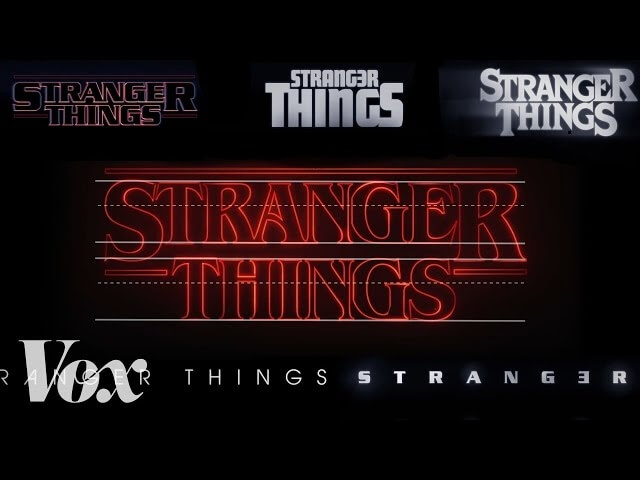
Christophe Haubursin investigates the origins of the title sequence and how it was developed, and also dives into the history of the font. It turns out to be a pretty fascinating ride with Imaginary Forces, the company behind the credits, linking Stranger Things to even more pieces of pop-culture history.
The typeface, ITC Benguiat, has been used throughout the years in iconic pieces of literature, music, and even warning against film piracy. It’s fascinating to see the various permutations that the font went through, as well as the blending of digital and practical means to create something a bit off but incredibly alluring. By using the same font found on a Smiths’ record or Choose Your Own Adventure book, Stranger Things’ nostalgic feel is intact from the beginning of the first episode.