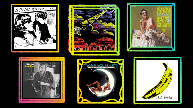
Whenever I close my eyes, I see Donna Summer perched suggestively atop a glowing crescent moon. In a decades-long career, no image better encapsulates the effortless glamour and sexuality of the “Queen Of Disco” than the cover of her fourth studio album, 1976’s Four Seasons Of Love. The four-song concept LP—which traces the rise and fall of a love affair across the seasons—included a stunning portrait of the diva themed to each track, but the art for “Summer Fever” became the album’s cover star (it is her namesake season, after all). Straightforward, yet suggestive, the artwork is emblazoned in my mind as a shimmering emblem of the disco genre.
168 Comments
On/off topic- While I like them and to no fault of their own Supertramp’s Breakfast in America album title and artwork makes me uncomfortable even nowadays – On topic- I feel like I’m partial because I also thoroughly enjoy both-
I’ve alwyas preferred the cover art on Homogenic, but I think that’s because I don’t really have the enthusiasm required to appreciate Post. I also like the homey scuzzy flavor of the Basement Tapes:I also kind of like the straightforward weirdness of Trout Mask Replica:and the 70s cheese that is the ISB:
The Homogenic cover is a bit racist
You should tell the person who designed it and the outfit.Oh right.
Huh?
No, it isn’t racist at all. But you’re going to see race in everything, so I guess it – along with everything else – is racist to you.Which is to say, your comment is completely redundant and narcissistic. Obviously.
Explain to me how a white woman doing yellowface isn’t racist
Oh, for the chance to smack this douchebag around just once.
Big surprise that a guy who defends a sexual predator is also violent
She looks kind of Asian in real life.
You do know where Iceland is, yes?
So what?
So it’s not in Asia
Doesn’t mean she doesn’t look Asian.
That’s not actually a fact. It’s more of an opinion.The fact that she’s white? That’s a fact.
How does she look more Asian on that cover than in real life?
She doesn’t look Asian in real life. Because she’s not Asian. She’s white. Hope that clears it up.
Well then, I guess that means she doesn’t look Asian on that cover either.
Except for the fact that her features are altered to appear Asian and she’s wearing the most stereotypical Asian outfit possible. But other than that, you sure cracked the case! You can go be dismissive about racism somewhere else now.
How exactly does she look more Asian in that photo? And how exactly is it “yellowface” to wear an Asian outfit?
Do you ever get tired of being purposefully dense? They’ve obviously altered her face and makeup to look more Asian. And it’s still a geisha outfit.
I don’t think saying something’s “obvious” is a good way to convince someone. I’ve seen pictures of her in real life and don’t think it’s “obvious” at all. Besides, how is wearing a geisha outfit racist?
hOw iS a GeIsHa OuTfIt RaCiSt
What does Torgo have to do with this?
Bro do you even meme
Quoting memes doesn’t automatically count as humor.
Sure beats defending racism
Do you plan to tell me how wearing a geisha is racist, or are you just gonna keep doing memes?
Are you so stupid that you can’t see how a white woman dressing up in the most offensively stereotypical Asian costume and altering her face to look more Asian isn’t racist, or are you just being purposefully dense as usual?
Would it be racist for an Asian to dress as a cowboy or something equally stereotypical?
Am I to assume you don’t have an answer?
The answer is of course not, because reverse racism isn’t a real thing. Which I know your disingenuous ass knows because you’ve been in a million of these arguments and have had it explained to you over and over again. Now you answer a question; why are you so continually desperate to dismiss and defend racism?
Believe it or not, your explanations aren’t so convincing that no one could fail to be swayed by them, and after a million of these arguments I remain unconvinced. Also, I find it weird you bring up “reverse racism” since in an Asian country white people would be a minority.
Literally anyone would be convinced if they were willing to consider social context and learn how it works. You didn’t even say anything about your stupid hypothetical being in an Asian country! And you didn’t answer my question
I didn’t answer “Why are are you so continually desperate to dismiss and defend racism?” because I typically don’t answer “When did you start beating your wife?”-type questions. Anyway, now that you know that my hypothetical scenario takes place in an Asian country, I wonder if that changes your answer.
It doesn’t because racism against white people is not a thing. Why are are you so continually desperate to dismiss and defend racism?
Again, when did you stop beating your wife? Also, I’d like to know the logic behind your idea that racism against white people isn’t a thing. If it’s because you can’t be racist against the dominant race(which I don’t agree with), then that wouldn’t apply in a country where a different race is dominant.
http://www.aclrc.com/myth-of-reverse-racism Why are are you so continually desperate to dismiss and defend racism?
In Asia racism against white people isn’t reverse racism.
Racism against white people isn’t a thing in Asia or anywhere else Why are are you so continually desperate to dismiss and defend racism
You still haven’t explained why racism against white people isn’t a thing.
http://www.aclrc.com/myth-of-reverse-racismWhy are are you so continually desperate to dismiss and defend racism?
That article doesn’t explain how racism against white people isn’t a thing in countries where white people don’t have power.
Why would it be
Your logic is that only people from groups not in power can be racist, which would include white people in countries where they aren’t in power.
No, the logic is racism against white people is not a thing. Try and keep upAlso why are you so continually desperate to dismiss and defend racism?
The only attempt you’ve given at an explanation for why racism against white people isn’t a thing is that article, which claims that racism against groups in power isn’t a thing, which doesn’t apply if white people aren’t in power.
The article you provided only talks about how racism is tied in with a disparity in power. People agree with that. But go live in Spain for a year and then tell me how people aren’t being racist to your lily-white ass.
Rudeness isn’t racism, spunky
not a chance… imagine living a life where all you can muster is “das racist” at literally everything in your sphere. To be honest… I really thought he was going to go the neck ring route but instead went with the “you wore a garment… DAS RACIST!”
sit down.
No u
70’s cheese related, the creator of Boston’s album hates that she did it. She’s a successful typography person and on the Abstract docu series she says something like- I just know when I die that album cover is going to be the first thing everyone brings up.
I always loved the ELO covers as a kid more though, but I was a huge Star Wars nerd in the late 70’s.
Years ago I was looking at houses and in one of them one entire basement wall was that cover art. It was pretty cool. Another’s basement was completely dedicated to Bon Jovi. Cardboard cutouts, framed t-shirts and albums, the works.
That Bjork album is iconic. An absolute album artwork monolith. That and Homogenic.
When it came out, the Post cover looked like it fell out of a spaceship. It was like looking at the future.
I’ve always really liked this cover
Bowie and GBV both have great album covers for completely different reasons.
I’d probably go with Bowie’s Aladdin Sane as his “best” album cover. Certainly it may be his most iconic, though I also love the cover of Let’s Dance as well.Didn’t realize until someone pointed it out but the cover of Low is a subtle joke. David Bowie Low (picture of his profile). In other words, Low Profile.
My favorite Bowie cover is Hunky Dory. He just looks so pretty with that long blond hair.
Four favorites:
I was hoping someone would bring up that Minutemen cover. It is just as much a classic as the Rubber Soul cover.
If you’re talking complete album art and not just the cover then Jeff Wayne’s War of the Worlds takes some beating. Some of the images weirded the hell out of me as a kid.
I spent hours as a kid trying to redraw that picture of the fighting machine melting the HMS Thunder Child.
Free Music Productions in Germany had some of the best covers
Jimmy Eat World – Bleed American. I feel like my whole sense of what adulthood would look and feel like was informed by getting a cd copy when I was 13. The grain of the picture on the cover, the mood of the photos in the liner notes – it’s perfect for a very particular mood at the intersection of elation and disappointment and a little world-weariness.Also the liner notes did this thing where the lyrics were printed as a poem without the choruses repeating, which has influenced how I think about the structure of songs ever since.
Jimmy Eat World was one of the only guitar bands that could possibly stand the test of time of that era, in that they were commercially successful and not utterly derivative, throwaway, and uninspired. Papa Roach is C grade shit of that era. Still very formulaic. System Of A Down was the only consistently good nu-metal band, and only for a period of an album or two.
“it’s easy to imagine Dean lounging on the cover’s stately couch, gazing at the furniture on his ceiling and thinking of all the ways that love has turned his life similarly upside down.” Yikes! That must be one hell of a record because the guy on that couch is Andrew Borden, Father of Lizzie Borden and that photo is of him after being murdered on his couch. Guess I should give it a listen!Anyways, here’s my favourite album cover: Joe Jackson – Night & Day
Always loved Floyd’s “Animals”.
This was my instant thought as well.
I love it too, but for Floyd covers, it has to be Wish You Were Here for me.
Wish You Were Here is great too. And of course Dark Side is iconic…
Fun fact: Wish You Were Here also included a postcard:…that Kinja won’t let me attach. Grrr.
There ya go!
I love the fact that they originally had floated the balloon over Battersea Power Station for the photo but it broke free so there was a giant balloon pig flying over London. They wound up having to paint the pig in for the cover.
There was an excellent coffee table book a few years back about the album art of Hipgnosis. Well worth searching for.
Yeah; pretty damn memorable.
I like’em:
Love that Gunship one. Also a, uh, friend of mine would like me to tell you that he really likes the Lords of Acid one as well.
Jacket!
I’ve always loved the KMDFM album covers by Brute!, aka Aidan Hughes. They’re like hyper-violent propaganda posters.
Said the same thing farther down.
I honestly don’t. They’re annoying and extremely repetitive. Essentially, like their albums. I’ve never seen a group so into hyperproduction yet with so little to show for it. They’ve should have made half as many albums, but making sure the songs are top notch. Symbols is pretty much the only album where the bulk of the songs are of high quality.
The stripper pictured is allegedly Cassandra Peterson a.k.a Elvira: Mistress of the Dark.
Gotta love Mr Bungle:
Love this album/artwork
Every time this subject comes up I feel compelled to repeat that I bought the Cars’ Candy-O FOR THE MUSIC!
my problem with the Fox Confessor Brings The Flood cover is, from a distance, the hedge makes the girl look like she has a huge hair do. Great record, though.
ladies and gentlemen, the patron saint of Ireland, the first Irish Pope of the church of Rock, St. Phil of Lynott, in a casual pose:
This and the back pic with the Rolls pulling the little Travel trailer.
A few of my favorites that I haven’t seen mentioned yet:Public Enemy – Fear of a Black Planet. This album was coming hard for you & the cover let you know.Jucifer – War Bird. I probably looked at this cover a dozen times before realizing that wasn’t a bird. Sade – Soldier of Love. This is just art. I’d hang this on my wall in a frame.
Willie Nelson – Red Headed Stranger. This looks like an old west poster, absolutely perfect match between cover & album.
Robert Rauschenberg’s revolving transparencies for Talking Heads’ Speaking in Tongues with clear vinyl and sleeve is the hands-down winner.https://www.artsy.net/article/artsy-editorial-the-story-behind-robert-rauschenberg-s-iconic-talking-heads-album-cover
It looks like Iggy is burning/melting into flames/lava, which is perfect for what’s contained on the album
Too bad this article was presented as a slideshow, it would have been nice to read it.Anyway, artwork related to piece of music is extinct, huh? I like the Sgt. Pepper cover.
Four in black and white:
I love that Slint cover. Squirrel Bait’s Skag Heaven also had good cover.
I think the cover of Springsteen’s “Born to Run” is as evocative of the album’s contents as any album art I can name, and the fold-out that reveals Clarence Clemons makes it that much cooler. That gets my vote. Second place- “London Calling.” Third place- Tom Waits, “Bone Machine.”
Pink Floyd-Dark Side Of The Moon. Simple but memorable. That prism is the best unofficial logo in rock history.
Doing my best to avoid covers already mentioned:Monk’s Monk’s Dream immediately came to mind, not because it’s a particularly great cover, but because it was the first album I remember buying based solely off of the cover. Figuring out where to start with a jazz artist sucks almost as much as asking a jazz fan for advice, so I resigned myself to just picking the album with the cover I liked the most. Lovage is a double pick first for its fairly obscure Gainsbourg reference and second for removing Dan the Automator from the cover of the instrumental version.Gainsbourg’s No. 4 also makes the cut, because I apparently have a thing for musicians in profile against a blue background. I still don’t have any clue what the cover of Monk and Rollin’s Friday the 13th album is, but I’ve never had an issue picking it out of a lineup. Blur’s 13, since I don’t know of a single other cover that so perfectly encapsulates the tone of an album. Blur’s Modern Life is Rubbish, because
On the subject of Monk, this one’s pretty great:Zevon’s got some good ones too:
That Monk cover is aces, and also I have so much nostalgia for it. My dad and I always listened to that record when he got home from work. I could recreate it note-for-note, so dear is it to me. 🙂
13 is a favourite, musically and artwork-wise. I love the shine on top of the figure’s head – I have no idea what it means or why it’s there, but it’s just perfect somehow
Fucking love that Lovage album. Dan the automator is the man. What a slept on classic
That Lovage album is the shit. Charles and Patton’s voices are wonderful together.
There is only one correct answer:
I like the Goo cover, but I think a couple of Sonic Youth’s preceding albums’ covers might be even better. Their first couple album are fine, but the cover of EVOL is fantastic, IMO, from the lettering to the combative pose in the photo:Followup album Sister originally had a great cover, but a copyright issue made them remove one of the images in the collage, and rather than replace it, there’s just an ugly black box (it’s the photo of the girl near top left that was removed):Then, of course, there’s Daydream Nation, which is one of my favorite albums of all time, with one of my favorite album covers of all time, a pre-existing painting by German artist Gerhard Richter that I just adore:
Big Brother’s “Cheap Thrills” I’ve had on my wall for ages, love the R. Crumb artwork and detail. RHCP’s most recent album had a great cover (music was alright, missing Frusciante, who’s back, baby…)
TISM’s Australia the Lucky CuntWas immediately given a cease and desist by Ken Done (whose artwork the cover is aping) and reissued under the appropriate name Censored due to legal advice:
This time featuring Sinead O’Connor.
Cold Chisel’s East, paying homage to the classics:
Look Sharp! Looks sharp!
Because hip hop has been so woefully underrepresented on here:The Low End TheoryAqueminiTo Pimp A Butterfly
When I first saw this album cover, I remember having a very strong reaction. Something about it just felt ‘wrong’ to me. I don’t know why. But I was intrigued and gave it a listen (based on a co-worker’s recommendation). The album is great and the cover has stuck in my brain. https://images.app.goo.gl/R4oJkP5UYc2b4DL4A
The fact that I clicked through every single page on this slideshow and did not once see the word “Hipgnosis” or, so far as I could tell, any reference to any band who commissioned Hipgnosis is surely some kind of criminal offence.And that’s literally just one band.(And if your favourite Hipgnosis cover is not represented here, I don’t disagree, but if I were to include all their great / iconic ones this entire website would run out of bandwidth.)
I have just learned that Hipgnosis did not do Band on the Run. The author apologises for the error, but in a kind of snide and prissy way that makes it clear that he’s petulant and resentful about having to do so.
The author has just double-checked and learned that Hipgnosis, contrary to his correction, did in fact do Band on the Run. The author would like it known that he humbly and graciously accepts that his earlier point was correct, but in a really irritating and passive-aggressive way that makes it clear in no uncertain terms how smug he is.The author would also like it known that the fact that Paul McCartney basically wagged the dog and told Hipgnosis what to do in no way corrects his earlier post, or the fact that he was right, so there.
Spinal tap.
Pissing and moaning about the unforgivable lack of Hipgnosis aside:(Possibly heresy: Abbey Road’s always done it for me more than Sgt. Pepper. Nice idea, but the collage effect is a bit too much and sometimes simple is better.)(Censored version provided for the benefit of all the kids reading AV Club and in the vain and futile hope to try and pretend I’m a serious album cover admirer rather than a letch.)And finally, from my “well, here’s something I never knew I needed until I saw it and now can’t live without it column”, here’s Matt Berry holding a falcon like a 1970s folk balladeer.
Jackie Daytona!
Someone upstream in the comment section (see bjork) would say that Kate Bush album artwork is racist. The AV comment club are sometimes an insufferable lot.
To be honest, I did hesitate due to this very concern. But then, I figured that mild 1970s-appropriation aside it’s still a great cover, and I feel safe in the assumption that Kate Bush has done far more to make the world a better place than anyone who’d try to score credibility points complaining about a forty-year-old album cover on the AV Club, so what the heck.
That’s a turkey, or maybe a pheasant, but sure, almost a falcon.
Whadda I look like, some kind of bird-knowing guy?!
Well, at least you didn’t call it a BAT!
The cover of David Bowie’s Heathen never fails to stop me dead in my tracks whenever I come across it. Not only is the composition striking in it’s simplicity, but with his white irises and unsmiling expression, Bowie seems uncharacteristically sinister.
The Pogues were great at recycling and editing old images for their covers. Peace & Love always makes me laugh.
Only proper answer to this question.
Derivative artworks are kinda the worst… that Soul Asylum artwork is a bore.One of my alltime favorites is Relayer by Yes (roger dean)
I have lots! The image of Cyndi Lauper dancing just looks so frenetic
and fun. “The Sisters of Mercy” painting used by Live. On Alice Cooper’s
Trash, the cover art is basically on the shirt he’s wearing. I
still wonder how Soul Asylum got a lady to walk down a road with two
naked children. Back in my dance crew days, the (very 90s) urban street
style on Significant Other, Tool’s Lateralus has a
translucent cover that reveals layers of the human body. Riddlin’ Kids
is as simple as a swift kick to the junk that still makes me chuckle. So does Blink 182’s now iconic Ene.But for my money, if I had to pick just one…I’m going to go with power in the simplicity of The Miseducation of Lauryn Hill. The imagery, carved into a classroom desk, is very evocative to me, and syncs up with the album’s themes so strongly.
https://www.illustrationchronicles.com/Smashing-Pumpkins-and-the-Infinite-Talents-of-John-Craig
First off, I implore the people in charge to stop formatting this shit as slideshows. This might not be as egregious as the 50+ lists (usually, they are “best [X] on [streaming platform]” type articles), but it is still utterly unnecessary, especially since most commentariat here are either using a simple (I just reduce my window size) or complicated hack (script fixes and other browser magicks). I know, I know, this is the way the internet works these days and my participation (clicking on and commenting on this article) is entirely voluntary, but you guys have to know you are losing a battle here for hearts and minds. Please know that the above statement is only directed at the ones holding the reins. The rest of you are just trying to earn a paycheck—likely not even a sizable one—so I can’t blame you.Per McLevy’s pick, that cover is great, but honestly, pretty much all Sonic Youth album covers are perfect as both artistic works in and of themselves (AFAIK, they worked to bring exposure to small, underseen artists throughout their run as a band*) and as a signifier (on t-shirts and posters) of your membership in the so-called “alternative nation”. Obviously, this is my top pick:(*Thanks a lot, Thurston, for fucking that up!)While I’m here, let me kick out a few more off the top of my head…One of the great Oliver Vaughn’s classic album covers for 4AD:Per an interview with Sleater-Kinney, some background on this next one: (Janet) Actually, this photo is of Carrie being hauled off a dance floor. She worked herself into a frenzy and passed out. People are laughing in the background because she’s wearing a bunny suit.Two great, wildly different photos—first by Maria Mochnacz and second by Kate Garner, I believe—capture the intensity and beauty of one Polly Jean Harvey:There’s probably more I could list, but I’m neither sure if this post will be seen buried in the comments nor if Kinja will screw up the formatting so bad that this will be an unreadable mess.
Yep, what a fucking mess! This is why I will always prefer WYSIWYG-type editors over this kind of smart interface. If you are going to make decisions about my layout, at least give me a chance to change them before posting. Yes, I know I have a short window to edit the post, but I’m clearly using my time to show off both my stubbornness and my lack of expertise in this editor. Have a good day, everybody! Stay safe, stay sane!
With an entire pantheon of crazy prog rock album covers to choose from, here are my choices:Tarkus by ELP
In the Court of the Crimson King by King Crimson
Octopus by Gentle Giant
Script for a Jester’s Tear by Marillion
Company Flow – Funcrusher Plus
I think that if you are going to talk about iconic album covers there are a few individuals who warrant special consideration:Reid Miles and Francis Wolff’s album covers for Blue Note essentially codified the look of jazz. Wolff’s smoky, high contrast photographs were the essence of jazz cool while typographer Reid’s bold and innovative graphic eye made him the music industry’s answer to Saul Bass.Then there was the team at Hipgnosis under the guidance of Storm Thorgerson and Aubrey Powell who dominated the look of rock albums in the seventies. Veering wildly between witty and stupid, sublime and vulgar, their work was bold, brash and impeccably rendered. Just the amount of photo compositing they accomplished predigital is nothing less than astonishing. I also think they had as much to do with the success of Pink Floyd as anyone in the band.https://wimwords.com/the-hipgnosis-album-cover-gallery/Speaking of prog rock, Roger Dean was the genre’s one man Disney Studios/ILM and mesmerized a ridiculous number of teenage boys (guilty!) into taking home some otherwise pretty dubious records.Last but not least, H.R. Geiger gets special mention for these little ditties that predated his work on “Alien” and were every bit as mind blowing at the time.
Always liked this 2nd Chapter of Acts cover, even if their songs had gotten pretty bland by this point.
Whilst it’s not their best album, it’s Eddie’s best look…
Other contenders:Green Day’s Dookie: I’ve always loved pictures with a million little things going on in the backgroundPop Will Eat Itself. Not a huge fan of the band but loved their album and single art. Very 90’sAphex Twin. Richard D james album. Nightmare inducing.Grace Jones: Island Life. There’s no-one who can strike a pose quite like her
Richard D James & Grace Jones. Those are both fantastic!
Let’s Take It To The Stage by FunkadelicAll N All by Earth, Wind & FireNumber Of The Beast by Iron MaidenStraight Outta Compton by NWAParliament Live: P-Funk Earth TourBootsy, Player Of The Year? by Bootsy’s Rubber Band
Love this one by Goldilox. Perfectly captures the dream-like disco quality of the album.
I was about 10 years old when I saw for the first time Led Zeppelin’s Houses of the Holy album cover at Woolworths. In my small town, LED Zeppelin was considered “acid rock” or what the satanist druggies listened to. Scared that my mother would catch me looking at these dirty naked children climbing up a steep incline, I circled the aisle again and again. I was oddly intrigued with the obvious symbolism and allegory of the artwork even though I had no idea of the meaning (disclaimer: I still don’t) that I sought out more albums featuring strange and somewhat surreal album covers. This was the beginning of my appreciation of outside-the-mainstream music, and the seeds that of what would became my visual arts career. So yeah, I’d say album art made an impression on me!
Dead Kennedys original (sorta), and NSFW, cover for Frankenchrist, by Geiger:Appropriately titled “Penis Landscape”.
I am not a fan of they might be giants, i was forced to go to a concert of theirs and it was disappointing, poisoning them for evermore. I do love the cover of Apollo 18 … A sperm whale fighting a giant squid in space, apparently from NASA’s archives. I’m really into sperm whales right now.
This is just in the “pretty picture” category, but this Band of Horses cover was one of the few that really stirred something in me the first time i saw it. Partially because of the picture, combined with the title and the fact that I was pretty excited about the record itself:
my favorite album cover is Ice tea’s body count with the dead cop on it
Twelve-year-old me, in 1972, read the 12-page newspaper that comprised the cover of Jethro Tull’s Thick as a Brick over and over again, trying to decipher its seeming inscrutability. 61-year-old me realizes it was just truly inscrutable, but it was fun at the time.
Sheer Heart Attack by QueenI love this description from Queen: An Exploded Diagram:The band appear on the album cover again, for Sheer Heart Attack, and I think it’s a beautiful piece of work, actually. Bold red font at the top, and the rest given to a glistening knot of Queenflesh. It’s fascinating and strange, as covers go.And Roger’s the lead, really. Sure, he’s upside down, but he’s got the most flesh on display, and he’s the only one looking directly at us. Freddie looks pensive. John looks like he’s stifling a laugh (possibly the most appropriate response) and Brian looks like he’s just remembered something important, but can’t work out if it’s a good or bad thing.But Roger, he’s cricked his neck to look us right in the eyes. He does not look comfortable, but he looks like he needs us. Like Freddie, his eyes are gorgeous. But Roger wants us. Freddie doesn’t even need us.
no mention of how EITS album artwork shows a plane crashing into a building and ironically enough came out a week before 9.11personally ive always loved SDREs Diary:
The only reason I bought this album was the for the artwork back in like 99 but damn that record ruled.
Kid A
I’m not sure Prince is pasted up in this image for the cover of Sign O’ the Times or it was deliberate but there was always something about this cover. Also I’m stoked it’s getting a deluxe release later in the year but not so the $150 price tag and that for that it does not include the movie.
Roxy Music, Country Life.
There are sooo many, but off the top of my head, here are some of my favorites and most memorable. Not in an y order.
I really like the Brute! KMFDM album covers, simple colors and blocky.
http://bruteprop.co.uk/
Spent days staring at this.
Easily my most favorite iconic album cover of all time