Donald Trump’s long proposed plan for a military-based “Space Force” moved from dumb idea to dumb visual design this week, as Trump tweeted out a new logo for the nascent organization of astronauts-but-hey-they’ve-got-guns. And lo, but the internet looked at this thing for about five seconds, squinted its eyes, and then declared: “That’s just the fucking Star Trek logo, you embarrassing pieces of shit.”
And so, indeed, it was:
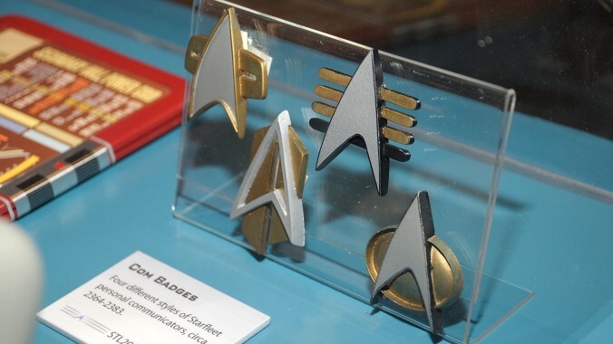
The history of Star Trek insignia is one of those wormholes that can end up eating an entire afternoon; the original arrow emblem was designed by the series’ famed costume designer, William Ware Theiss. (Whose somewhat infamous theories on costuming the show’s female cast would probably be right in line with a Trump-headed space organization, anyway.) Various eras and missions of the show have altered the look, with one of the Starfleet Command insignias that most resembles the new Space Force logo reportedly dating from a 1996 episode of Deep Space Nine.
But while we might want to rag on Trump’s dumb new goal of playing with his astronaut soldier toys in space, it’s not like Star Trek and real-world space organizations trading design ideas is anything new. The Starfleet mission patches have been consciously patterned on NASA designs for years—the original Apollo emblem is an especially close match—and the real-world agency, in turn, has never been shy about adopting names, images, and more from TV’s most enduring vision of interplanatary exploration. (It’s not for nothing that Mike Okuda, co-author of the Next Generation Technical Manual, and one of the people primarily responsible for the look of modern Trek, moved on to NASA after his 18-year tenure with the series ended.)
Of course, there’s an extra, timing-based bit of irony to all this, given that the logo was released just a day after the premiere of Star Trek: Picard, a show that takes steady aim at the idea of the Federation’s moral infallibility as a direct reaction to modern political concerns. We have to assume we’re only seconds from seeing a video of Patrick Stewart growling “It was no longer Starfleet” at a flummoxed reporter, images of the Space Force logo flickering across the screen.
47 Comments
Sure. Space Force, in practice, is going to be just as real as Star Trek.
But with more racism and money.
The Prime Directive of profit.
To be fair, it looks a lot like the original Air Force Space Command badge (which this new branch is meant to replace)
Don’t bring logic and common sense to this fight, bro.
Yeah, the root of the problem is the stupidity of everyone in the media playing along with giving Trump credit for “creating Space Force” — when he’s just renaming an agency that has existed as part of the AF since 1982 — U.S. Space Command.History is being rewritten right in front of our very eyes — consider that they’ve already changed the landing page of the previous “Space Command” website, though not the ones deeper in, like this:https://www.afspc.af.mil/About-Us/You can be sure that Donnie’s speeches giving himself 100% credit for this “new” branch aren’t gonna mention any of that…
Someone should tell trump that if he is Commander in Chief of the Space Force that he should wear a wonderful red shirt to honor his space warriors.
Or at least, you know, a red hat.
It’s shuffling around various commands. The Airforce, Army, and Navy all have their own space departments. Space Force is moving all of them under the same umbrella with a degree more autonomy. Similar to how the USMC is a department of the Navy but it’s own branch of the military.
To be fair, I trust that whoever set that line of type was shot into space.
I hope whoever put that shitty gradient on the Federation logo discovered first hand that the final frontier was actually at the bottom of an active volcano.
Yes, that is all well and good, but the design of the new logo, while using similar elements from the AF logo, changes it in ways that very closely mimic the Starfleet emblem. Here’s an example.
St. Louis-based Mega Burger uses the Gateway Arch as their logo. They introduce the new Double Mega Burger and promote it heavily using their logo overlapped. Basically double arches. Then they get rightly sued into oblivion by McDonalds, because that’s infringement.
Still, Trump’s SPAACCCCEEEE FORRRRCCCEEEE! sounds so mockworthy because — Who are we supposed to be Forcing against again…?
That poor center-A.
No one told the designer that the ribbon isn’t supposed to be glued to the bottom of the shield
Close enough for an infringement lawsuit???Please say yes.
One day, in the far off future, a man will stare out the porthole window of a Star Class Cruiseliner and at passing Private Galactic Transporter. He’ll read the name TRUMP INETERSTELLAR….and he will weep.
Complete with typo.
so i forgot to mention, in the future, Private Galactic Transporters are built by machine factories that are Tweet Controlled. A User’s private tweets direct the construction and naming of said spacecrafts. So yes….TRUMP INETERSTELLAR is the maiden ship of a Fleet that also includes FAKE NEWS #GetThosedems II and THE BEST WORDS! NO COLLUSION!.
I don’t know if it’s canon or not, but I remember reading the Star Trek novel Federation many years ago and a nice description of why the Starfleet insignia looks the way it does was:
“One scene (pp 137-139 in the paperback edition) has a captive Cochrane
explaining to villain Adrik Thorsen the principle behind warp drive. He
starts by drawing a star and explaining that the line bisecting it
represents light speed. He then draws a high, symmetrical curve, saying
that it represents the infinite power needed to reach warp speeds under
general relativity. Then he draws a much lower, asymmetric curve, with
its peak after the imaginary light-speed line, stating that it
represents the power usage of warp drive. The resulting graph strongly
resembles the Starfleet emblem, especially as seen in Star Trek: The Original Series; later in the book, Captain Picard refers to the symbol as the “Cochrane delta”.” – from Memory Alpha
I don’t know if it’s canon or not, but I remember reading the Star Trek novel
It’s not canon. Only things that have appeared on-screen in live action are canon (so, not TAS). Not sure why though, the on-screen “canon” contradicted itself in the first season of TOS, so “canon” is pretty much a meaningless term in Star Trek.
Paramount decided TAS was Canon a few years ago.
Oh wow, I missed that. Happened in 2007. Makes sense, considering a number of TAS episodes are referenced in other Trek properties.
I’m glad someone else remembers that book – it was excellent. By far the best of any non-canon material that I ever read.
I also recommend anything by Peter David, Imzadi in particular.
And I thought the novel Unity was the ending to DS9 the TV show missed.
I don’t think I ever read Unity, but yeah, Peter David’s stuff was the next thing atop the list after Federation. I remember really liking Imzadi and Q-Squared, but my favorite of his was Vendetta.
Star Trek? It’s obviously a ripoff of the ship from Asteroids!…Hey, not to give Hollywood any ideas, but why haven’t we had a big-screen CGI-bombast-heavy adaptation of Asteroids yet?
Fuck. I have to admit I kind of like it BECAUSE it looks like the Starfleet insignia. First space shuttle was named Enterprise (used for testing, was not orbit capable).
American military heraldry is so boring.
The Space Force is still part of the Air Force. It is not a new branch of the Armed Services.
One has to respect those famed Space Force engineers, who can turn rocks into replicators!
You’re too early. Starfleet is founded after WWIII. So. Somewhere at the end of Trump’s second term.
I thought we avoided WWIII in the Star trek timeline -enabling us to cooperatively develop as one people.
One thing Star Trek was always very certain about is that for THAT to happen, mankind needed another World War to really fuck things over before they get better.
https://memory-alpha.fandom.com/wiki/World_War_III
We ARE, however, right on track for the Bell Riots discussed in Deep Space Nine, so…yeah…
That’s odd. Starwars’ Empire was right there. Or was that too on-the-nose?
More likely Trump knew trying to skip out on a bill from Disney, as is his standard practice, would end terribly for him.
If you are going with forrest camo for your uniform using an arrow in your logo makes sense.
Knowing Trump’s “logic”, he won’t understand why using forest camo in space doesn’t make sense.
I hope Paramount and the Roddenberry estate sue the shit out of him.Also, what the hell is “Space Force” supposed to do anyway? Fight aliens?
The camo uniforms seem silly but they’re better than the all black with highly polished jackboots ones that Steven Miller suggested. (Those are still under consideration for the new Presidential Federal Police Corps that Trump has planned)
“(Whose somewhat infamous theories on costuming the show’s female cast would probably be right in line with a Trump-headed space organization, anyway.)“they probably wouldn’t hire a gay dude.(also his theory is right – if you apply it to both sexes)
Yeah you got no reason to complain .The Star Fleet emblem is a variation of the NASA one . You can’t claim that your variation of their emblem is infringed when they modify their original.
Yeah you got no reason to complain .The Star Fleet emblem is a variation of the NASA one . You can’t claim that your variation of their emblem is infringed when they modify their original.
Honestly, the whole Star Trek franchise deserves no better.
My favorite detail is that whoever slapped this together copy-pasted the exact star clusters from the NASA meatball insignia.